Blog
Sep 2nd, 2012
Lightroom 4 ~ Develop Module ~ Hints Part 2
Presence Panel and the Tone Curve
When we last looked at the Develop Module, we covered the first two tools in the Basic Panel: White Balance and Tone Controls, so now lets look at the Presence Controls: Clarity, Vibrance and Saturation. Although the names of the three sliders have not changed with Lightroom4, the math behind them is much improved.
There is only really one way to become familiar with the power and effect of these tools, and that is to experiment.
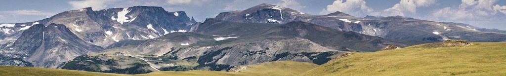
Treatment Panel
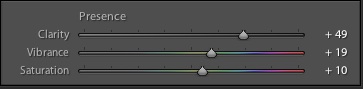
1. Clarity adds snap, crackle and punch to an image by increasing mid-tone contrast, which adds both depth and crispness to your images. When adjusting this slider, I zoom in to 100% and try different values. I then check it again at normal (fit) view. Halos or artifacts that were often introduced at higher settings in LR3 are no longer an issue with the superior LR4 results. Higher settings can also give you a faux HDR effect, whereas negative clarity can give mystical effects to waves and waterfalls and a softening glow to skin, which of course is great for portraits. Try a setting of around 50 to make your image look crisp and minus 30 for softening skin.
2. Vibrance makes your image, well, vibrant! With Vibrance, the saturation is adjusted so that as colors approach full saturation, they remain in gamut. Vibrance effects the saturation of the lower-saturated colors more, whilst affecting the higher-saturated colors less. Vibrance is a wonderful tool in that it also prevents skin tones from becoming over saturated. Start with a setting between 10 and 25.
3. Saturation adjusts the saturation of all image colors equally from –100 (monochrome) to +100 (double the saturation). Too much saturation creates out-of-gamut-colors and makes editors crazy. Try settings between 5-15.
Tone Curve
Typically, tone curves are used to adjust contrast in a specific portion (tonal range) of an image, the steeper the curve, the higher the contrast. In PV 2010 the default for raw files was Medium Contrast, in PV 2012 the default is Linear.
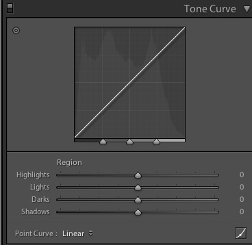
The Default View: Parametric Curve-Linear.
The Parametric Curve is like having training wheels, it allows you to adjust the curve while protecting the photo from extremes. You can adjust it four ways: drag on the curve itself; adjust any or all of the four sliders below the curve; use the drop down menu to change from the default Linear Curve to Medium or Strong Contrast; or use the Targeted Adjustment Tool (TAT). To use the TAT, click on the ◎ in the upper left of the panel and place it on an areas of the image you wish to adjust. Click and mouse up or down to brighten or open up or to darken or close down that area of the image.
At the bottom of the curve, just above the sliders are three triangles. You can move these to adjust how much of the range is affected by each of the sliders. The best way to understand is to try it for yourself. Remember, double-clicking on any of the triangle sliders will reset it to the default position.
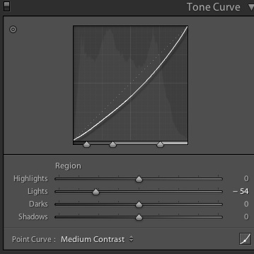
Parametric Curve with Tonal Range Triangles adjusted.
Point Curve, this is new in LR4 and is a custom interface for users who became addicted to complicated curves in Photoshop. The Point Curve gives us the ability to correct tone and color on a per channel basis. Very fine adjustments can be made to specific areas of the image with the Point Curve. Choose your channel, Red, Green or Blue, from the drop down menu and then by adding “points” to the curve you can set locks allowing you to adjust only the portion of the curve that lies between the points and thus create some crazy curves causing some really weird effects. Caution, the training wheels are off!
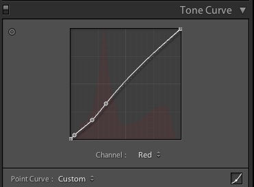
Point Curve with two points set on Red Channel.
To toggle between the Parametric Curve and the Point Curve click on the lower right curve icon.
Tone Curve Tip
For the majority of your images the default will work fine. If you have a problem area then begin with the default Linear and use the Targeted Adjustment Tool on specific areas as necessary.
Experiment often and fearlessly!
Lightroom Weekend Workshops in Bozeman
Lightroom Collections
Recent Entries
- Not Just Jaguars: A Pantanal Wildlife Photography Workshop Through Wild Brazil
- Wild Alaska by Private Yacht: Why This Katmai Photo Workshop Is Different
- Clear Views, Clean Angles: Why Vehicle Space Matters on a Botswana Photo Safari
- How to become a better wildlife photographer in your own back yard.
- Five Reasons Why I Shoot in Manual Exposure Mode
- Capturing Winter Wonder: Photographing Yellowstone’s Winter Wildlife
- The Artist’s Eye
- Icy Dispatch
- Blogging the Blog - National Wildlife Week
- Bison Behavior and Survival
- Winter Highlights Report
- Coyote Climbs Tree and Steals Bobcat’s Duck!